Dubbed the worst website in the world for many, many legitimate reasons; there is a lot to learn here to prevent your website from receiving a negative classification.
Created to highlight the flaws and errors that can and do occur in terms of website design, http://www.theworldsworstwebsiteever.com/ is a virtual headache. From woeful navigation, pulsing and pixelated effects and an overall maximalist website design that defies belief, it is a lesson in what not to do when creating a website. Here we look at seven sins that it commits:
1. Header
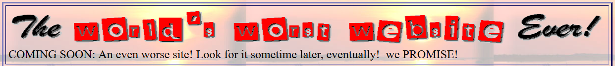
The fact that the website has no fixed header greets you as soon as you enter the site. In the header area there is a barely legible pixelated font stating “The World’s Worst Website Ever!” – so one thing in this websites favour is that it is not guilty of false advertising or misrepresentation. Without a header, we are left without an important and universal navigation and anchor section.
2. Grid and Width
The homepage is built in a widescreen format that means you have to scroll horizontally on both desktop and mobile to take in all of the content. Going off the grid in this way has added to the clunky interface and usage of the website as you have to explore all four directions in case you miss the content that you need to find.
3. Updates
As stated in the footer area, the website was last updated in January 2014. Therefore with two full years of no updates, we can safely say that this website is not optimised to render well on mobile devices. Its SEO is most likely in tatters too if it has not kept up with the times in this way.

4. Graphical Bombardment
Under the header area, we can see an assortment of moving graphics with extremely harsh edges and a frantic, pixelated appearance. Graphics can be used to good effect, but they must exist for a reason (whether aesthetic or otherwise) and pertain to your website design and business ethos. Here we are given flashing multi-coloured stars in space, Lemmings at work wearing hardhats and a mailbox that folds itself into an enveloped letter.
5. Spelling and Grammar
While a copywriter is not 100% necessary for each website design-build, you should seek one if you struggle with writing, grammar and punctuation etc. Otherwise, you present an extremely unprofessional and unintellectual appearance to your website visitors. This makes a bad first impression on them and will more than likely scupper any chances of a sale or conversion. Here is an example from the website: “we’re stoked to be able to bring u da best in REALLY BAD WEBSITE DESIGN! Our goal is to break every single rule in website design!!!”
6. Colour Clash
It is clear that no colour or typography palettes were considered at all here. The website portrays polar opposite colours that create a jarring experience for the eye such as red-on-blue and blue-on-red. With this, the connective and connotative features of correct colour usage are lost on website visitors. It also means that the website cannot be associated with any single colour/colour scheme to achieve branding and identity.
7. Images
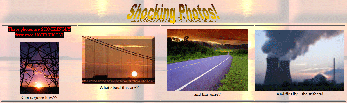
Apart from the garish graphics, the images on the website are also rendered incorrectly. Most suffer from a low resolution and when stretched on the website produce a pixelated and low-quality image. The addition of filters and a decorative frame around these may have been used to distract from this fact, but if anything it only makes proceedings busier.
Contact the expert team at Ireland Website Design to have a modern and responsive, custom business website created that is free from any sins. Our clients choose us because our websites drive sales to their business.