Here we show you how to strike the perfect balance between interrupting the shopping experience and gaining e-mail addresses with three tried and tested pop-up stipulations that website users respond to.
Pop-ups can be annoying to website users, pure and simple. As the name suggests, the literally pop up during the website experience to convey some information to the user. This usually takes the form of an incentivized e-mail sign-up form to gain the users’ e-mail addresses and offer them an incentive to do so. Yet to do this effectively, while consciously acknowledging that the pop up will interrupt the shopping experience, take into account the following three tried and tested methods:
1. The Five-Second Rule
Research and case studies suggest that the optimum time for a pop-up to appear on a website page is after a person has been looking at the page for five seconds. Conversion rates for this timeframe have shown to be far greater than pop-ups that appear before this (i.e. instantly, after three seconds) or after this (i.e. ten seconds, fifteen seconds). Bear this in mind when implementing pop-up into your eCommerce website; set it to appear after five seconds to hit the sweet spot.
2. Turn Interruption into Incentive
As we have stated, one cannot deny that a pop-up interrupts people browsing on a website, hence their name. To lessen the blow here, make sure that the pop-up alludes to an incentive that will make users want to sign up. In this way, the websites users’ initial annoyance has now transformed into an opportunity – by signing up; they may be offered a discount on their first order placed on your eCommerce website.
3. Keep the Exits Clearly Marked
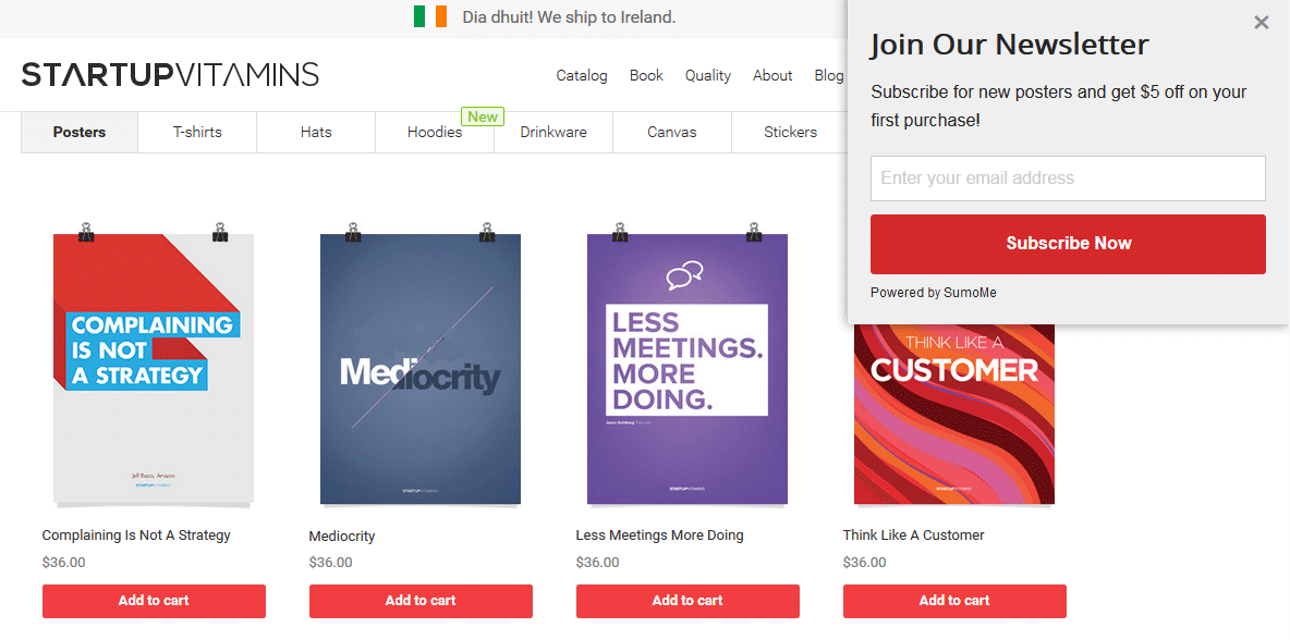
A major thing to keep in mind with pop-ups is that your website users (and for that matter all website users) never ask to see them, they are forced upon them. Due to this, you need to ensure to have a clear exit in place for them. The most common way to do this is obviously by having an X in the top right-hand corner. As an offshoot of this, avoid having your pop-up occupying all of the website page space. Have it either centered in the middle of the page or fixed in a corner/at the header or footer but sized so that the original page is still visible around it. The above example picture shows a pop-up window that appears in the upper right-hand corner of the screen. With this, give website users the option to click on this original webpage space to return to that webpage.
Take the above three points into consideration when it comes to adding pop-ups to your eCommerce website. The experts at Ireland Website Design can design for you the best sign-up forms to drive your sales and make conversions. Contact us today for all of your online presence and branding needs from the experts at Ireland Website Design.